Where Should Your Eye Look on a TV Screen?
The “visual center” of any page is just slightly above and to the right of the actual (mathematical) center of the page. Some call it the museum height. There is also the divine composition of the Fibonacci Ratio to bring a balance to your images and the simplicity of the rule of thirds. And finally there is video. 
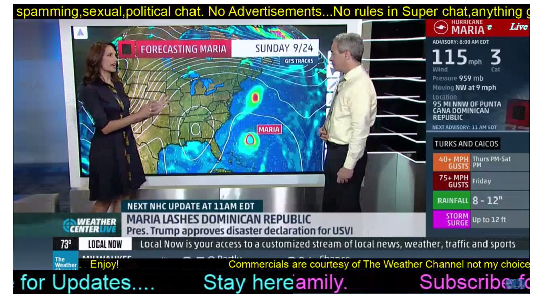
What happens to us when we design for television, video or YouTube? This is the age of distraction, but do we really need to cram every possible fact on the screen? Where is your eye flow to go? What should you read first? Should you listen or read the scrolling information at the bottom?
TV news stations will squeeze back the screen to show sports scores, stocks or other information not important enough for the anchors to read. Besides making the image on the screen smaller, the squeeze-back effect tends to visually add 10 to 20 pounds to the anchor on the screen.
Eye flow and design are just as important in video image as they are in paintings or print design. The elegance of the Fibonacci Ratio is the same for an artist as it is for a videographer–the only problem for the videographer is that the rule of thirds should be applied to each and every shot and the on-screen application of graphics.
![]()


